- You have not saved any projects.
Cadbury Front End
Cadbury, the multinational confectionary company now part of Mondelez International, sought to discover retail innovation opportunities at the “front end” checkout area of the grocery stores, where many Cadbury products are often shopped for.


The project objectives included not just finding ways to sell more Cadbury products, but to offer food retailers innovative ideas for how to improve the overall front end experience. Namely, how can stores transform this painful checkout process into an easier and more compelling experience, and perhaps even leave customers with a more positive final impression of the store brand?
The front end of the grocery store is consistently ranked as one of the worst experiences in everyday life, right up there with going to the DMV and sitting in a traffic jam. Stores push shoppers through a “cattle chute” and then, because they’re a captive audience, try to force feed them all kinds of candy, magazines and other impulse items that people don’t necessarily want or need. Nowhere else in the retail world would this kind of strategy be considered a good idea. Further, this negative experience can only hurt the store brand’s overall value. Shook Kelley sought to reposition the front end experience, and provided a wide range of different directions for possible solutions, from game-changing innovation ideas that would require environment transformations, to more pragmatic solution sets focused on rethinking existing front end fixture arrangements. In the end, Cadbury partnered with a select number of retail partners to provide innovation support. RoNetco Supermarkets, owners and operators of a number of Shop Rite stores in the Northeast, decided to work with Cadbury and Shook Kelley to develop a prototype front end design.
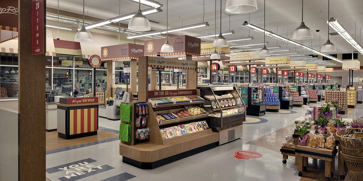
The design goal was to provide a solution flexible enough for any supermarket in the industry, meaning it would have to work with checkouts in their existing position and layout. The front end was distinguished as its own shoppable department within the grocery store, much like the bakery department or meat department. The new experience provides Shop Rite with opportunities to communicate to shoppers on multiple levels: the department level tells a brand story, the middle level focuses on shoppability and ease of use, while the near-distance explains product selection. From the department scale, overhead canopies, flooring and alternating fixture designs help frame the checkouts, establish a more human scale and instill visual order and rhythm.
Can the checkout area of a grocery store be a place to convene?
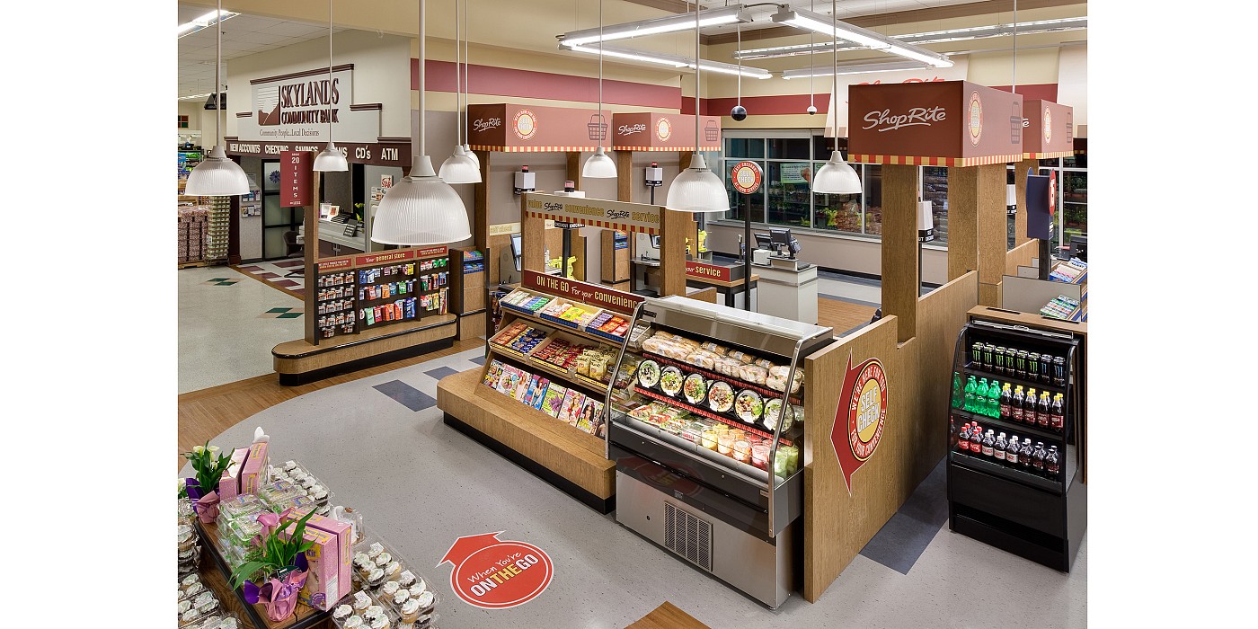
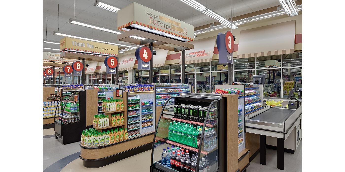
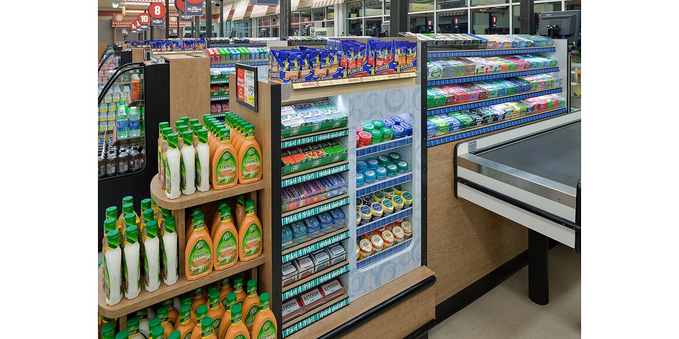
Checkout lanes, perimeter walls and promotional vignettes were unified through a more coherent system of signage, colors, materials, flooring and lighting. Awnings along the front windows created opportunities for neighborhood market tonality. On the case level, strategic fixture lighting dramatically highlighted and featured products. Wood laminate fixtures and stair stepped, angled shelves improve shoppability and organization of products. Different materials and different graphic communication help to visually frame up each product category based on shopping mindsets—e.g., a sweet reward, a cool refreshment, entertainment, etc. Keeping fixtures below eye level help open up the feel of the check lane.
Self-checkout was solved for separately because of its unique configuration. A specially merchandised, grab and go “ante-room” area for self-checkout was created with the mindset of self-checkout shoppers in mind. This ante-room is defined by nesting tables, an open faced cooler, decorative pendants and floor graphics. A concierge podium helps customers navigate their way to self-checkouts with easier service access.
Shoppers enjoyed the new front end experience at Shop Rite, as the brand improved its overall customer satisfaction. Moreover, Cadbury garnered an improved reputation in the food retail industry for being a source of innovative ideas focused more on their retail partners than only growing their own bottom line. Building more sustainable sales relationships around innovation and the retailer’s continued success was a deliberate outcome.
Can the checkout area of a grocery store be a place to convene? Of course, the checkout queue is not an experience where anyone wants to linger. But one goal this front end innovation project did accomplish was to get shoppers feeling more relaxed, less anxious and more at ease with the checkout process. And that, in turn, helped make Shop Rite a more enjoyable place to be.
Behind the scenes of the project is where convening really happened in this project though. By helping build a forum and leading an industry conversation about front end innovation—through articles, client-retailer support meetings and conference talks—Shook Kelley convened food retailers around new ideas and the potential for new ways of thinking to be unleashed through innovative design.