- You have not saved any projects.
Save Mart
Shook Kelley’s design and rebrand projects for Save Mart, with stores in the Central Valley of California, represent an innovative approach to rethink their traditional supermarket experience. The work created more ways for Save Mart to better engage with communities found in the region, by reflecting consumer lifestyles and local food culture. A primary strategic goal was to redevelop the brand to be more relevant in a highly competitive marketplace.





Save Mart is a chain of supermarkets, the first brand created by The Save Mart Companies (TSMC) in 1952. The largest family-owned grocer in California, TSMC operates 83 Save Mart stores, along with stores under the banners of Lucky California, FoodMaxx and MaxxValue Foods.
Initial brand strategy work by Shook Kelley led to a number of related design projects for consumers and the organization’s internal culture, including a new brand identity, a ground-up prototype store with new innovation programs in Modesto, California, and renovations of existing stores throughout the chain.
The Save Mart brand strategy focused on building more meaningful connections between the brand and its origins in the Central Valley of California, one of the world’s most productive agricultural regions. Save Mart has been working with local producers, suppliers and farms for many decades. But outside of produce displays, the brand was not necessarily building on those relationships as a primary point of differentiation, uniqueness and/or storytelling for the whole brand experience.
The Save Mart brand embodies the pride locals have in the Central Valley and their agricultural roots, qualities which no other food retail brand can claim.
Deep dive research into the brand, its markets, audience, internal culture and competition helped identify how Save Mart could serve the food culture and audience of the Central Valley in uniquely valuable ways. In short, the Save Mart brand embodies the pride locals have in the Central Valley and their agricultural roots, qualities which no other food retail brand can claim. Based on this deeper understanding, the Save Mart brand strategy strongly evokes value messages, balanced with “direct from the source” food stories specific to its region.
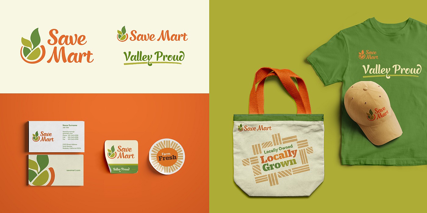
Making its home in the Central Valley, the new Save Mart graphic identity sought to tap into this meaningful source. The logo mark is an abstraction of the Central Valley’s geography, where the San Joaquin Valley and River meets the Sacramento Valley and River. The Save Mart logo mark, with leaves sprouting from the center, represents the Central Valley’s role as a provider: a cornucopia of freshness and land of abundance. The logotype is inspired by familiar and approachable hand painted signage, which references local produce stands offering fresh products straight from the source. Taken together, the logo stands for Save Mart’s extraordinary focus on fresh produce, going beyond standard offerings thanks to the brand’s strong roots and the Central Valley’s agricultural wealth.
Save Mart’s prototype 54,000 square-foot Modesto store best represents the revitalized brand experience. Broadly speaking, the store is divided into two major parts, which balance the brand’s messages of food culture and everyday value: Produce Depot and Vibrant Market.
Produce Depot tells a local story of produce and agriculture, fresh from the source in the Central Valley. Corrugated metal is employed to allude to warehouses and the transportation of produce. Fresh prepared local favorites activate this side of the store, in two open stalls under a clerestory letting in natural light, with all sides anchored by industrial I-beam structures. A large plant wall made of pallets and large “Local” graphics painted directly on concrete blocks, serves as a visual backdrop to the overall produce department. The Produce Depot features many innovative components brought to life by Shook Kelley’s design, through a series of stall experiences that evoke local food stands.
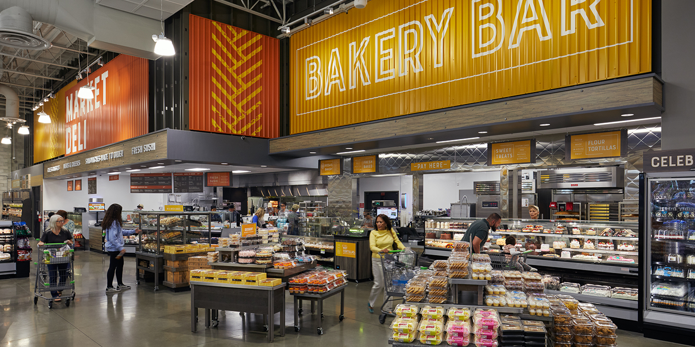
At the Bakery Bar fresh tortillas are made on display, while specialty sweets from the local Escalon-based Rosa’s Bakery are offered, such as pan dulce.
Upon store entrance, a Valley Fresh stall greets shoppers, featuring fresh-cut fruit cups, on-the-spot custom guacamole, fresh-made salsa, smoothies, aguas frescas, infused waters and more. Fruits and vegetables are cut to order, or offered pre-cut and mixed in bulk at a self-serve bar. The Valley Made prepared foods stall features hot foods, salad bar, ceviche bar and soup with a toppings bar. At the Bakery Bar fresh tortillas are made on display, while specialty sweets from the local Escalon-based Rosa’s Bakery are offered, such as pan dulce. A Nut Station anchors the bulk food offering, and features both locally sourced and in-store roasted nuts.
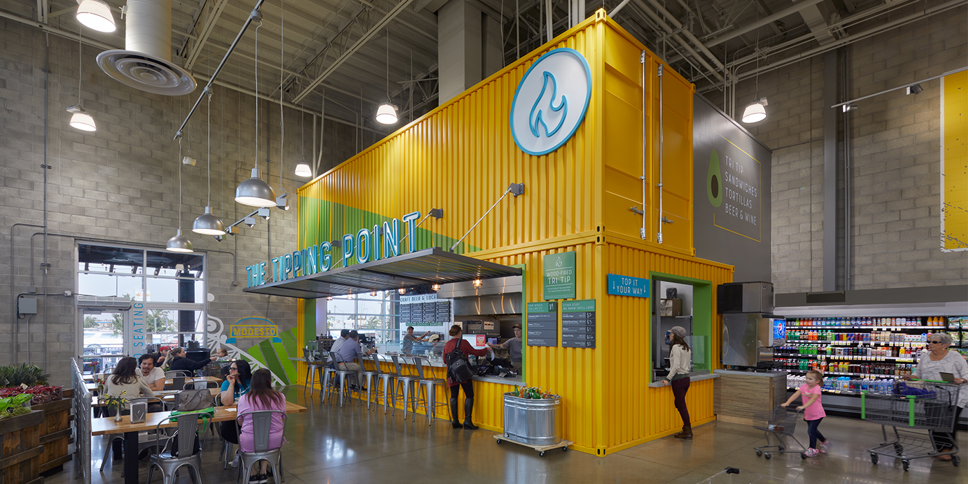
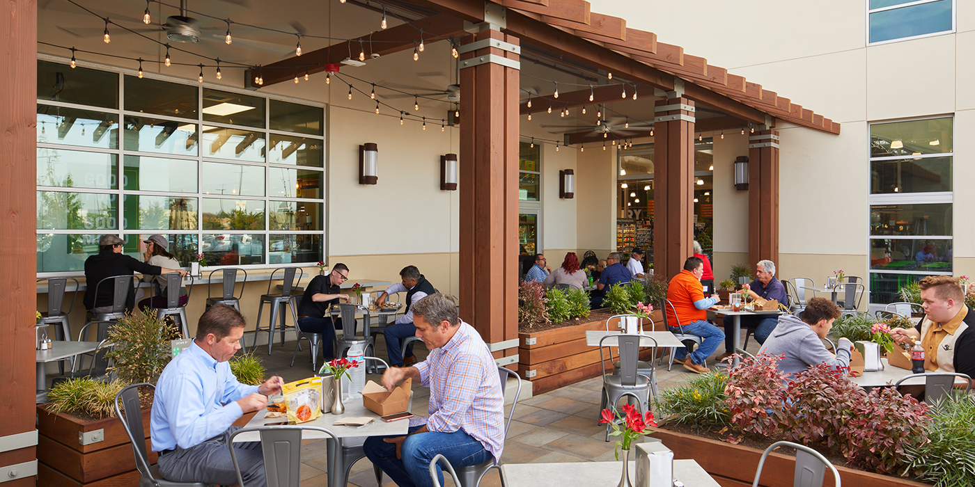
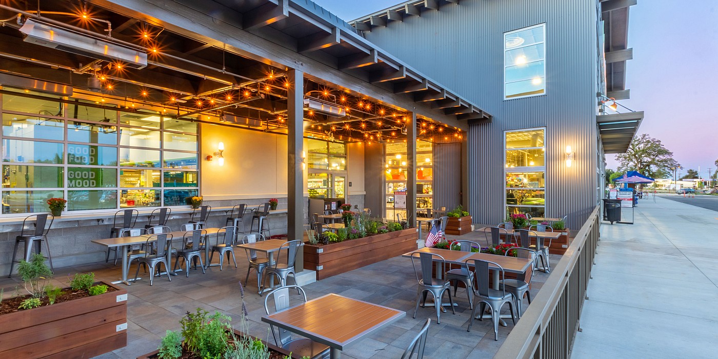
Adjacent to the Produce Depot, a fast casual restaurant called The Tipping Point offers a compelling dining destination. With indoor or outdoor garden seating, The Tipping Point serves tri-tip beef, barbecued and served five different ways, alongside a range of other contemporary menu items, like street corn, churros and other side dishes. The Tipping Point is housed in a shipping container, which helps tell a food culture story about local food, food trucks and food halls. Tri-tip was chosen because of its regional origin and connection to the Central Valley, a consistent theme found throughout the store experience.
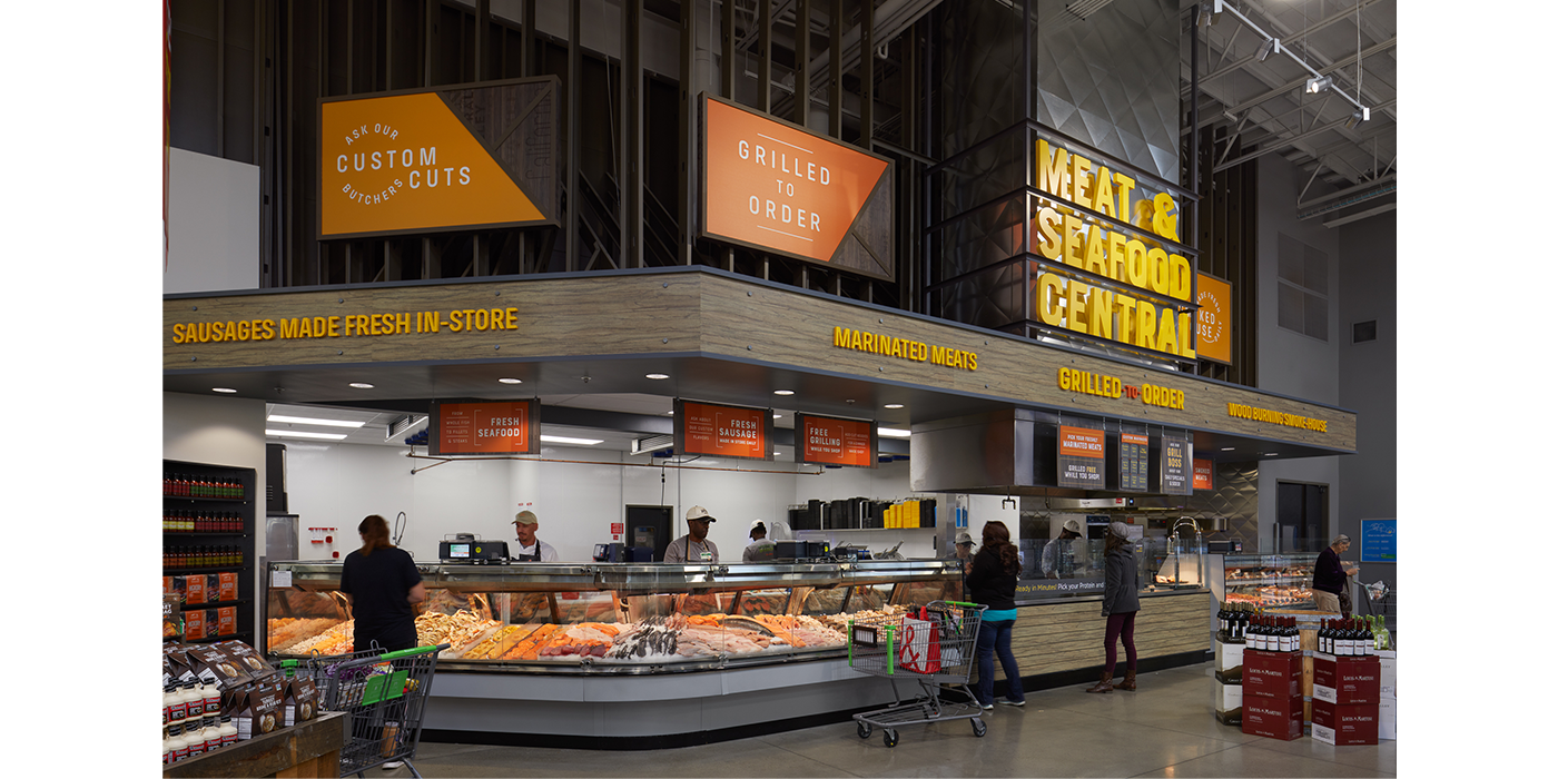
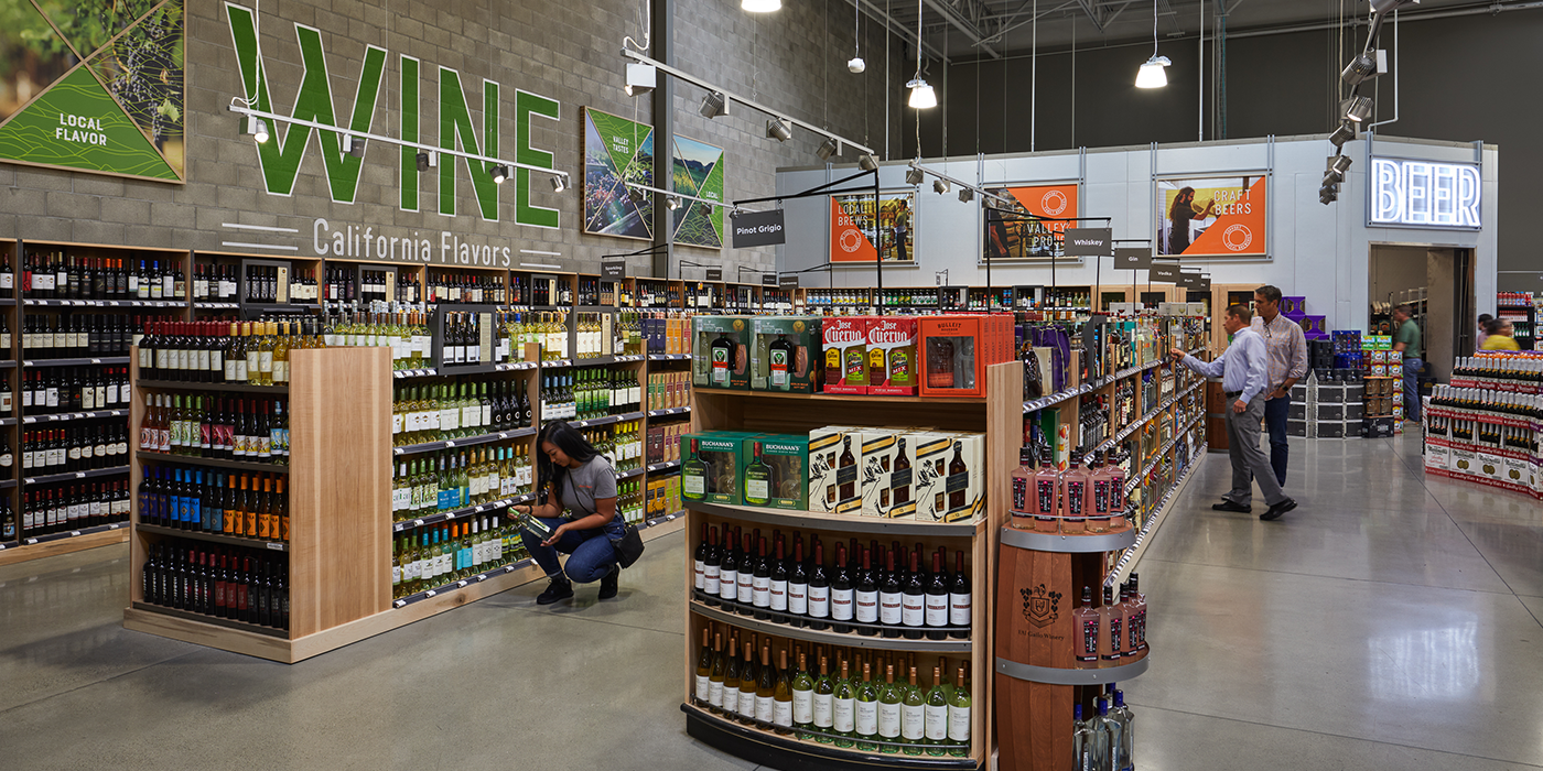
The Vibrant Market side of the store creates a raw exposed feel that is more value-driven, with descriptive marketplace language that visually tells the story of expert merchants in each department. A 45-foot, multi-paned entrance window wall alludes to familiar agricultural structures. Each Vibrant Market department’s environmental graphic design uses agricultural crates and exposed raw sign structures to complement this expertise. The Vibrant Market also includes a number of value-add components, including a walk-in beer cooler and a “value alley” with pallet-based special deals. A meat and seafood grilling station gives customers the option to have purchases grilled in-store with a variety of marinades and seasonings.
The store’s many architectural and environmental graphic design details, combined with featured offerings and unique amenities, tell the brand’s stories and bring the brand strategy to life. Materials used in the store, including concrete blocks, corrugated metal and exposed framing and ductwork, pay homage to the Valley’s agricultural and manufacturing industries. Environmental graphics throughout the store feature photographs of real Central Valley producers, farmers, craftsmen and workers—creating an atmosphere of authentic local community and industry. At the same time, exposed framing and visible concrete blocks throughout the store communicate messages of value and “direct from the source” stories in ways specific to the Central Valley.
The revitalized store experience helps Save Mart find new ways to compete in a challenging marketplace, by using The Power to Convene. The store is a unique reflection of the Central Valley, which tells the story of the Save Mart brand. And as a true prototype, this flagship store is also serving as a testing ground for innovation, bringing together pilot programs. For example, one unique way the store convenes is through community partnerships, including Save Mart’s efforts to work with local 4-H clubs on raised garden beds in the outdoor patio. The Empire 4-H Garden Club and Kiernan Klovers 4-H Horticulture Club will maintain the beds, and once harvested the food will be sold out front.
