- You have not saved any projects.
Rocket
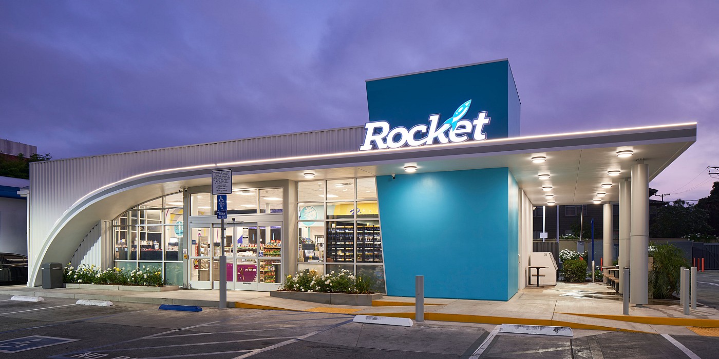
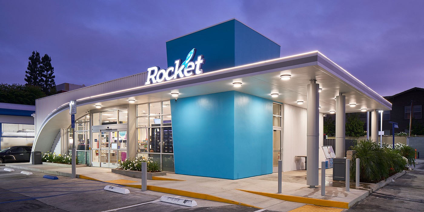
United Pacific approached Shook Kelley with the challenge of developing a new, singular convenience store brand named, “Rocket,” for their multitude of different gas station banners. The goal was to optimize the convenience store offering in light of industry innovations, and improve food perceptions overall for the West Coast chain.


Shook Kelley studied common food and beverage offerings in the convenience store market and identified gaps and new opportunities that would appeal to the core customer, as well as broadening the appeal to potential customers already on site pumping gas. With a range of hot dog toppings such as hot sauces on tap, churro saucers with dips and assemble-your-own “LaunchBox” meal displays, Rocket brings more excitement and energy to the typical gas station/c-store experience.
The concept design embodies a playful, dynamic, and modern personality, and is meant to activate joy and reflect innovation. The core idea of speed is used throughout the design to reflect the Rocket identity, as well as to manifest the needs of their key customers—to keep them moving with life! This idea is prominently represented in the sweeping canopy element on the building exterior, which is meant to symbolize a rocket contrail and the dynamic motion of a rocket launch. The finish materials and graphics utilized are intended to be both futuristic and modern, while simultaneously giving a playful nod to the nostalgic past era of fast, personal convenience service.