- You have not saved any projects.
Zagara's Specialty & Natural Foods
Faced with managing two competing brands, executives at Zagara’s Specialty & Natural Foods and Genuardi’s Family Markets looked to Shook Kelley to lead them through a brand strategy analysis.

The goal was to help them bring clarity to both brands and create a road map for future decisions affecting each brand. Once the branding process was successfully completed, targeted prototype store designs for each brand were developed.
The new Zagara’s was located in a former Wanamaker’s department store in a trendy, up-and-coming neighborhood in Jenkintown, Pennsylvania. Built in the 1950s, the building was a landmark in the community and has now been transformed into a vibrant shopping center.
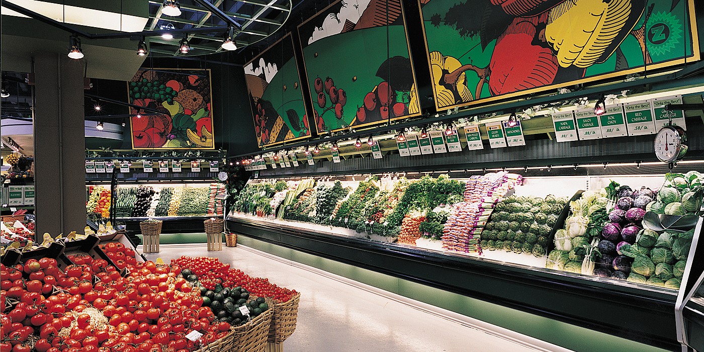
Zagara’s was designed to fit the high-income, cosmopolitan demographic of the neighborhood. With a Bed, Bath & Beyond and upscale women’s fitness center on the second floor, the supermarket was well-positioned to capitalize on a customer base that desired only the best from its shopping experience.
The goal was to create a road map for future decisions affecting each brand
The interior architecture, design, signage and merchandising for this upscale supermarket created an environment that celebrated food and elevated the food shopping experience to a whole new level. Shook Kelley used art deco elements throughout the 35,000-square-foot store, including zigzag patterns, floating soffits, columns and geometric shapes. The store design also used bold colors from the ceiling to the floor tiles, elements of internationalism, original murals and a marquee-style coffee and juice bar. An art deco theme was chosen to suggest an attitude of extravagance and celebration reminiscent of the Roaring Twenties.